100 Polyester Sublimation Shirts: The Ultimate Guide
You press a shirt, peel the paper, and the design looks weak. Not ruined. Just dull enough that you know you can’t sell it with confidence.
That moment usually sends new makers chasing the wrong fix. They tweak printer settings, swap paper, or blame the press. Sometimes those things matter. But with sublimation, the shirt itself often decides the result before you even print.
If you want clean color, strong wash performance, and a finish that looks professional instead of homemade, 100 polyester sublimation shirts are the starting point. Everything else, artwork, heat press settings, and customer satisfaction, gets easier when the blank is doing its part.
Why Your Sublimation Prints Look Faded and How to Fix It
A faded print usually starts with one problem. The fabric doesn’t have enough polyester for the ink to bond properly.
100% polyester sublimation shirts are the gold standard because the fibers are fully compatible with sublimation ink, which enables 100% ink bonding for maximum vibrancy and durability. In practical tests, 100% polyester shirts retained full color intensity after laundering, while 63 to 65% polyester blends faded noticeably, with only 63% of ink surviving wash cycles according to this sublimation shirt comparison.

That’s why a shirt can look decent coming off the press but disappoint later. The image may transfer, but if the fiber mix isn’t right, it won’t hold that color the way a true sublimation blank should.
The fast diagnosis
If your shirt looks washed out, ask these questions first:
- Check the fiber content: If the blank isn’t 100% polyester, the faded look may be the fabric, not your press.
- Look at the intended finish: Some blends create a softer, vintage effect. That’s a style choice, not a bright retail finish.
- Think beyond the first press: A shirt that loses punch after washing will lead to returns, remakes, or awkward customer messages.
Practical rule: If you want bright, repeatable, sellable results, start with the blank that gives the ink the best chance to succeed.
New makers often want a single magic setting. There isn’t one. Professional results come from matching the right design, the right press setup, and the right shirt. But if the shirt is wrong, the rest of your setup has to work twice as hard.
Understanding How Sublimation Ink Bonds with Polyester
Sublimation doesn’t work like screen print ink or heat transfer vinyl. It doesn’t sit on top of the fabric as a separate layer.
The easiest way to think about it is this. Sublimation is closer to dyeing the shirt from within than sticking color onto the surface.

When sublimation ink is heated, it changes from solid to gas and bonds directly with polyester fibers at the molecular level. Polyester fibers are receptive to dye absorption under heat, while cotton fibers aren’t. The higher the polyester content, the more surface area the ink has to bond with, as explained in this overview of polyester count for sublimation.
What’s happening inside the shirt
A simple chain of events takes place during pressing:
- You print the design on sublimation paper.
- Heat activates the dye.
- The dye becomes a gas.
- That gas moves into receptive polyester fibers.
- As the shirt cools, the color stays in the fabric.
That last part matters. A good sublimation print doesn’t usually feel heavy because the color isn’t sitting on top like a patch.
If you want a broader walkthrough of the production flow, this guide to the dye sublimation printing process is useful for seeing where fabric choice fits into the full workflow.
Why cotton causes confusion
Cotton confuses beginners because you can still see some transfer. The paper releases dye, the press applies heat, and an image may appear. That makes it feel like sublimation “worked.”
But appearance and bonding aren’t the same thing.
On cotton, the chemistry isn’t doing you any favors. The image may look acceptable for a moment, yet it won’t have the same depth, strength, or staying power as a print made on polyester. That’s why people often describe cotton attempts as dull, faded, or short-lived.
The press can transfer the design. Only the right fiber can hold it properly.
Why 100 polyester sublimation shirts are so dependable
A full polyester shirt gives you consistency. That matters more than most new businesses realize.
Consistency means:
- Colors come out closer to what you expected
- Edges stay cleaner
- Repeat orders are easier to reproduce
- You spend less time guessing whether the problem is the artwork or the blank
A lot of frustration in sublimation comes from chasing variables. Polyester removes one of the biggest ones.
Later, when you start comparing shirt feel, fabric weight, and perceived quality, you’ll see that “100% polyester” is only the first filter. But it is the first filter for a reason. Without it, you’re asking a process built for polyester to perform on a material that doesn’t naturally cooperate.
To see the process in motion, this short video helps make the bonding concept easier to visualize.
Not All Polyester Is Created Equal
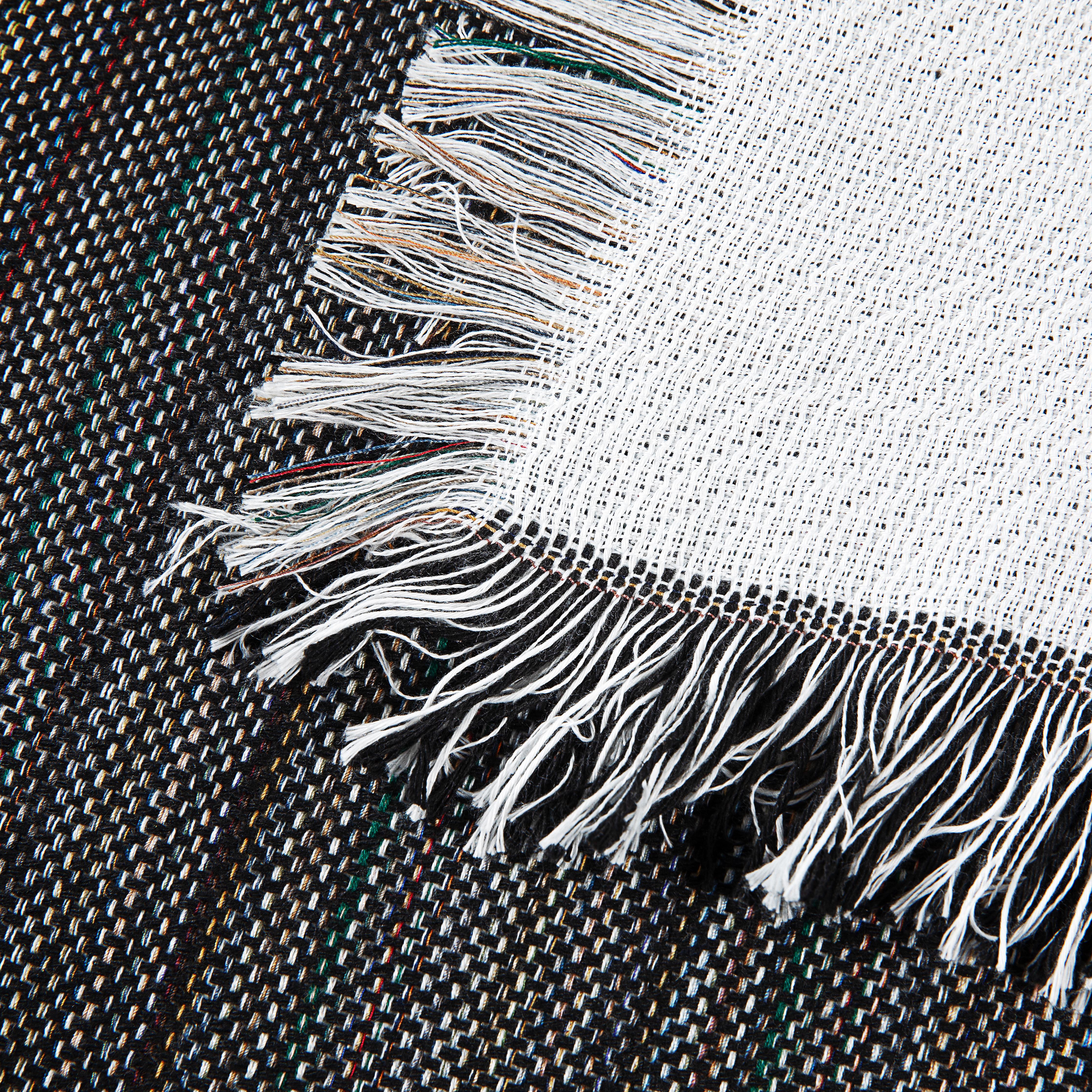
Two shirts can both say 100% polyester and behave very differently in your shop.
One feels smooth, prints bright, and looks retail-ready. Another feels flimsy, shows press marks easily, or ends up being the shirt customers complain about because it looks shiny under indoor lighting. That difference usually comes down to fabric construction, not just fiber content.
Testers often note that 100% polyester shirts can feel “slick” or “shiny,” while a 65/35 polyester-cotton blend is described as “more cottony” and “very comfortable,” which highlights the trade-off between top-tier print quality and wearer comfort in this discussion of 100% polyester for sublimation.
Fabric weight changes how the shirt feels
If you sell to end customers, fabric weight affects the perceived value of the shirt before they ever comment on the print.
A lighter shirt can feel airy and athletic. It can also feel thin, clingy, or slightly transparent depending on the knit and color. A heavier shirt often feels more substantial in hand, which can make the final product seem more premium.
That doesn’t mean heavier is always better. It means you should match the blank to the customer.
- Performance wear customers often expect a lighter, smoother feel.
- Boutique gift buyers usually react well to a shirt that feels less flimsy.
- Event merch customers may care more about bright graphics than a luxury hand feel.
If you’re selling online, this matters even more. Customers can’t touch the shirt first, so your blank choice has to carry the experience.
Knit type affects both print and wear
Makers often skip over knit type because product listings don’t always explain it well. But knit structure changes how the shirt drapes, stretches, and shows a printed image.
A tighter, smoother knit usually gives you a cleaner print surface. The design looks sharper because the fabric surface is more even. A looser or more textured knit can still work, but it may soften detail and change how the print looks when the shirt stretches on the body.
Think about the kind of artwork you sell:
- Fine text and detailed logos usually prefer a smoother surface.
- Bold graphics are more forgiving.
- Full-front prints look better on a shirt that doesn’t twist or distort easily.
The comfort trade-off is real
A lot of beginner content talks as if print quality is the only thing that matters. That’s shop thinking. Your customer wears the shirt. They decide whether your product gets reordered.
If you only chase color output, you can end up with a blank that photographs well but feels too synthetic for your audience. If you only chase softness, you can lose the vivid look that makes sublimation worth using in the first place.
Sell the shirt your customer wants to wear, not just the one that looks strongest on the press.
That means asking better questions before you buy blanks:
| What to check | Why it matters for your business |
|---|---|
| Fabric hand feel | Affects comfort, reviews, and repeat purchases |
| Surface smoothness | Influences print sharpness and color presentation |
| Opacity | Helps avoid complaints about thin or see-through garments |
| Stretch behavior | Changes how artwork looks when worn |
| Finish | Determines whether the shirt looks matte, athletic, or shiny |
What experienced shops look for
Shops that get predictable results don’t buy shirts by fiber content alone. They sample. They press test designs. They wash one. They wear one.
A practical evaluation looks like this:
- Hold the shirt to light: If it looks too sheer, customers may see it as cheap.
- Rub the fabric between your fingers: If it feels overly slick, decide whether that suits your market.
- Print a dark, saturated design: This shows whether the surface handles strong color cleanly.
- Test stretch areas: Look at the chest and side seam zones after pressing and after wear.
- Wash your sample before committing: A blank can print well once and still disappoint later.
For many small sellers, the right answer isn’t the softest shirt or the brightest shirt. It’s the one that creates the fewest problems after the sale.
Preparing Your Designs for Flawless Sublimation
You can choose the right shirt and still sabotage the job with weak artwork. This happens all the time.
A design that looks crisp on a laptop can print soft, muddy, or off-color once it hits sublimation paper. The fix usually starts before you ever click print.
Start with clean artwork
If the image file is poor, the shirt will advertise that flaw.
Use artwork that’s built for print, not just for screens. Avoid tiny files pulled from social media, blurry customer screenshots, or logos that have already been compressed several times. Sublimation is very good at exposing low-quality art.
Here’s the practical shop rule:
- Use high-resolution files for photos and detailed artwork.
- Use vector files when possible for logos, text, and line art.
- Zoom in before printing and inspect edges, not just the full design view.
Customers rarely say, “the resolution was low.” They say, “the print looks fuzzy.” Same problem.
Design in RGB, not by screen print habits
Sublimation workflows often behave differently from screen printing workflows. That catches a lot of people the first time they move between methods.
RGB design files usually make more sense for sublimation because you’re working toward a digital print process, not separating spot colors for ink mixing on press. If you build everything by old screen print instincts, color expectations can drift.
That doesn’t mean every screen color will print exactly as shown. It means your workflow should match the process you’re using.
ICC profiles are boring until they save a job
A lot of new makers avoid color management because it sounds technical. I get it. It feels easier to just print and hope.
But hope is expensive when you’re pressing customer orders.
An ICC profile helps your printer, ink, paper, and design software speak the same language. Without that alignment, blacks can shift, reds can lean strange, and skin tones can become unpredictable.
If color matters to your customer, color management is part of production, not an optional extra.
Three design habits that prevent common mistakes
Some habits are simple and still save a surprising number of reprints.
- Mirror your artwork: Sublimation transfers in reverse. If text reads correctly on paper, it will read backward on the shirt.
- Allow a little breathing room around the design: This helps when aligning transfers and reduces visible placement errors.
- Oversize with intention for edge-to-edge placements: If your placement goes close to a seam or edge, a little extra design area helps avoid an accidental white gap.
Watch out for fake black
Black is a common trouble spot in sublimation. New makers expect a deep, neutral black and get something softer or warmer.
Part of that comes from artwork setup. Part comes from profiles. Part comes from the blank itself, because fabric texture and brightness can change how dark tones read after pressing.
A few practical habits help:
| Design issue | What usually causes it | Better approach |
|---|---|---|
| Fuzzy text | Low-res file or rasterized logo | Use vector art or sharper source files |
| Weak dark areas | Poor color setup or profile mismatch | Test color-managed output before production |
| Jagged edges | Artwork scaled up too far | Build at final print size from the start |
| Unexpected color shift | Screen expectations don’t match print output | Print small test swatches before full runs |
Build a repeatable pre-press routine
The best digital prep isn’t fancy. It’s repeatable.
Before you print, check:
- File quality
- Correct size
- Mirrored layout
- Color settings
- Placement plan on the actual garment
That last one gets ignored. A chest graphic that looks balanced on a template can sit too high, too low, or too wide on the actual shirt size. Lay out the actual blank and think like a customer looking in a mirror.
Shops that produce clean work consistently don’t rely on memory. They build a checklist and use it every time.
Mastering Your Heat Press for Consistent Results
Your heat press is where a good design either becomes a professional product or turns into a remake.
Most shirt problems come down to three variables working together. Temperature, time, and pressure. I think of them as a recipe. If one ingredient is off, the whole job can drift.
For 100% polyester shirts, industry-standard settings run from 385°F to 400°F (196°C to 204°C) for 40 to 75 seconds with light to medium pressure. Automated systems typically run at 400°F (204°C) for 45 seconds according to this heat press settings guide for sublimation shirts.
Start with a proven baseline
If you’re new, don’t reinvent the process on day one. Start with a controlled baseline and adjust only when the blank or result gives you a reason.
A dependable starting workflow looks like this:
- Pre-press the shirt briefly: This helps remove moisture and wrinkles.
- Lint roll the pressing area: Tiny fibers show up in finished prints.
- Secure the transfer: Movement causes ghosting.
- Press with even pressure: Too much or too little can both hurt the result.
- Lift carefully: Don’t slide the paper during removal.
If you want a deeper look at equipment choices and setup, this guide on choosing a heat press for apparel is a helpful reference.
Time, temperature, and pressure don’t work alone
A common beginner mistake is changing all three settings at once. Then you don’t know what fixed the problem.
Use a slower method.
Temperature
Too low, and the ink won’t fully gasify into the fabric. Too high, and you risk fabric shine, scorching, or unwanted press marks.
Time
Longer isn’t automatically better. If the print looks weak, the answer might be uneven pressure or moisture, not extra seconds.
Pressure
Pressure should be firm enough for full contact, but not so heavy that it leaves harsh lines or distorts the fabric. Many shirt problems blamed on temperature are really pressure issues.
A good press cycle feels controlled, not forced.
Shirt construction changes the press behavior
Even within 100 polyester sublimation shirts, different blanks react differently. Fabric weight, surface finish, and moisture-wicking treatments can all change how the shirt handles heat.
That means your ideal settings may shift slightly from one blank to another. This is normal shop work, not failure.
A practical adjustment mindset:
- If the print is light all over, check contact and temperature accuracy first.
- If some areas are light, check pressure distribution and platen coverage.
- If the shirt looks flattened or shiny, back off pressure or review dwell time.
- If edges look blurry, look for movement before you change the heat.
Common Sublimation Print Issues and Fixes
| Problem | Possible Cause | How to Fix It |
|---|---|---|
| Ghosting | Transfer paper shifted during or after pressing | Tape the transfer securely and lift the press straight up |
| Faded print | Low temperature, weak contact, moisture, or wrong blank | Verify settings, pre-press the shirt, and confirm fiber content |
| Uneven color | Inconsistent pressure or lint under the transfer | Lint roll thoroughly and check platen pressure across the print area |
| Press lines | Pressure too high or paper edges imprinting | Reduce pressure and use protective setup methods that suit the blank |
| Scorching or shine | Excess heat or over-pressing | Lower temperature or shorten dwell time |
| Blurry edges | Shirt or paper moved during pressing | Secure the garment and transfer, then peel carefully |
Build your own shop recipe
What separates experienced shops from frustrated ones isn’t luck. It’s note-taking.
Keep a record for each shirt blank you use:
| What to record | Why it helps |
|---|---|
| Blank name | Prevents confusion between similar shirts |
| Temperature used | Helps you spot patterns |
| Press time | Makes repeat jobs easier |
| Pressure feel | Gives context that numbers alone can’t |
| Result after wash | Shows whether the setting worked long-term |
This becomes your internal production manual. When a reorder comes in months later, you won’t have to guess.
Small habits that improve consistency fast
You don’t need a huge setup to improve results. A few habits tighten quality quickly:
- Warm up your press fully before production
- Use the same placement method every time
- Press a test shirt when switching blanks
- Store paper and shirts in a dry area
- Avoid rushing hot unloads
Shops lose money in tiny avoidable ways. A sheet that shifts. A shirt with trapped moisture. A rushed press opening. None of those feel dramatic in the moment, but they create the pile of “almost good” shirts every owner remembers.
Consistency is what customers pay for. The heat press is where you earn it.
Ensuring Your Custom Shirts Last
A finished shirt isn’t done when it cools. It’s done when the customer has washed it, worn it, and still feels good about buying from you.
That’s why care instructions matter. They aren’t filler you tack onto a packing slip. They protect your work and help the customer keep the shirt looking the way it did on day one.
Significant quality variation exists among 100% polyester shirts, and few suppliers publish standardized durability benchmarks. Testing has shown that pre-bleached 100 polyester shirts can sublimate and wash beautifully, but creators still need better durability benchmarks across shirt grades, as noted in this discussion about washing and colorfastness in polyester blanks.
Give customers care instructions they’ll actually follow
Keep your instructions short and practical.
- Wash inside out: This helps reduce friction on the printed area.
- Use cold water: It’s gentler on the garment.
- Tumble dry low or air dry: Lower heat is easier on the shirt.
- Avoid harsh treatment: Rough care shortens the life of any garment.
If your care card reads like a chemistry manual, it often goes unread. Plain language works better.
Treat care instructions as part of the product, not an afterthought.
Sell durability honestly
Don’t promise what you haven’t tested.
If you’ve sampled a blank, pressed it, and washed it successfully, say that in your own words. If you haven’t, keep your durability claims general. Customers appreciate confidence, but they also notice when sellers overstate performance.
A better approach is to position longevity as a mix of two things:
- The quality of the blank
- The way the customer cares for it
That framing is honest, and it helps reduce unrealistic expectations.
Protect your reputation with one simple habit
Wash test your samples before listing a shirt for sale.
One test run tells you things a product page can’t. You’ll learn whether the shirt keeps its shape, whether the print still looks sharp, and whether the feel changes after laundering. That gives you better product descriptions and fewer unhappy messages later.
Sourcing Quality Blanks for Your Growing Business
When your business is small, you can work around a bad blank once or twice. When orders start stacking up, inconsistent blanks become expensive.
One batch presses clean. The next one feels different, fits differently, or reacts to heat differently. Now you’re adjusting settings, second-guessing yourself, and wasting shirts trying to get back to a result you had last week.
That’s why sourcing matters as much as pressing.
What to look for in a supplier
The right supplier doesn’t just sell you a shirt. They help you avoid production chaos.
Look for these signals:
- Consistent fabric quality: You want blanks that behave the same from order to order.
- Clear product details: Fiber content, feel, and intended use should be understandable.
- Reliable stock: Running out mid-order creates real business problems.
- Responsive support: When a product question comes up, you need a real answer.
- Fast shipping: Short domestic fulfillment windows help when customer deadlines are tight.
A useful product page should tell you more than “100% polyester.” It should help you picture the actual item in production and in a customer’s hands.
Read blank listings like a business owner
Most beginners shop blanks the way hobby buyers do. They scan price first.
Price matters, of course. But blank selection should also answer a few harder questions:
| Buying question | Why it matters |
|---|---|
| Will this feel right for my audience? | Comfort affects reviews and repeat business |
| Will it press consistently? | Consistency lowers waste and stress |
| Will it hold up after sale? | Durability shapes brand trust |
| Can I get it again? | Reorders are easier when the blank stays available |
| Is the supplier focused on textiles? | Specialists often describe fabric behavior more clearly |
A cheap blank can still cost you more if it creates remakes, complaints, or hesitant customers.
Why specialists are often easier to work with
General suppliers carry everything. That can be convenient, but it also means textile details sometimes get buried.
Textile-focused suppliers usually think harder about hand feel, construction, printability, and how the finished product is perceived. That matters whether you’re buying shirts, towels, blankets, or other sublimation blanks.
Spark Blank Textiles is one example of a supplier built around premium blank textiles for customization, with a curated range that includes sublimation-ready products such as blankets and towels. If you’re evaluating polyester apparel options too, this article on a white polyester shirt shows the kind of fabric-focused guidance that helps makers make better buying decisions.

The real goal is fewer surprises
The best sourcing decision usually isn’t the one with the lowest upfront cost. It’s the one that gives you fewer surprises in production and fewer issues after delivery.
You want blanks that:
- Match your brand position
- Support repeatable press results
- Feel good enough to justify your pricing
- Make reordering simple as you grow
That’s how small shops start acting like established ones. Not by buying everything. By choosing blanks more carefully.
If you’re building a product line around 100 polyester sublimation shirts, take the same mindset you’d use with any serious textile category. Sample first. Press test. Wash test. Wear test. Then buy with confidence.
If you’re building a custom product line and want textile guidance from a supplier focused on quality, comfort, and printability, explore Spark Blank Textiles. Their selection is built for makers, print shops, and small businesses that need dependable blank textiles for sublimation and personalization.