Pro Tips: how to make a transfer for at shirt
You’ve got a blank shirt on the table, a design on screen, and about six tabs open arguing about transfer paper, vinyl, DTF, sublimation, pressure, peel timing, and placement. That’s usually where people stall.
Most makers don’t struggle because the process is impossible. They struggle because the advice online is fragmented. One tutorial is for Cricut hobby projects, another is for full production shops, and nearly all of them assume you’re decorating a basic cotton tee. That leaves a big gap for anyone trying to build a product line that includes towels, fleece throws, Sherpa blankets, or other textured blanks.
A lot of small sellers start with t-shirts, then realize customers also want coordinated gifts, promo bundles, or home items. That’s when transfer work gets more demanding. Placement, pressure, and surface prep stop being minor details and start deciding whether the finished piece looks sellable. That gap is real. A major underserved angle for small businesses is precise placement on premium blanks like sublimation throws or woven blankets, as 68% of sublimation providers report misalignment issues on non-apparel blanks over 300 GSM according to Transfer Express placement guidance.
If you're still at the stage of turning a personal image or customer photo into wearable art, this practical guide to putting a photo on clothes is worth reading alongside your transfer workflow. It helps close the gap between “nice image” and “print-ready graphic.”
Your Journey From Blank Textile to Branded Product
The first clean transfer usually changes everything. A shirt stops being a blank. A towel becomes event merch. A throw blanket becomes a gift item someone is willing to pay for because it looks finished, centered, and intentional.
That’s the part most beginners underestimate. Making a transfer for a t shirt isn’t only about putting ink or vinyl on fabric. It’s about matching the method to the fabric, prepping the artwork correctly, and pressing it in a way that survives wear and washing.
A lot of bad results come from perfectly decent artwork applied with the wrong process. Full-color photo art on the wrong transfer paper can feel stiff. A good DTF print can still fail if pressure is uneven. A blanket can print beautifully and still look off because the artwork sits too high or drifts off center during pressing.
Practical rule: Most transfer problems don’t start at the press. They start earlier, with a mismatch between design, material, and method.
Once you understand that, the process gets simpler. You stop hunting for one universal technique and start choosing the right one for the job in front of you.
Choosing the Right T-Shirt Transfer Method
A lot of wasted money shows up before the press ever heats up. A maker buys a stack of transfer paper because it was easy to find, then tries to use it for dark shirts, fleece throws, and every rush order that comes through. The method ends up driving the product instead of the other way around.
Choose the method around the blank, the artwork, and the order size.
The three methods that cover most small-shop work are HTV, printable transfer paper, and DTF or sublimation-style full-color transfers. All three can produce sellable work. They just behave very differently once you move beyond basic t-shirts and start decorating textured goods like fleece and sherpa blankets.

HTV for simple graphics and names
Heat Transfer Vinyl is still one of the most dependable options for clean, bold decoration. It works well for names, numbers, left-chest logos, simple icons, and designs with solid shapes. If a customer wants personalized pieces in short runs, HTV often wins on control and speed.
It also gives strong coverage on dark garments, which matters for spirit wear, team shirts, and event apparel. Cut lines stay sharp, placement is predictable, and reorders are easy if you save the file well.
The trade-off is labor. Small details slow down cutting and weeding. Layered vinyl can get bulky fast, especially on softer retail shirts or plush goods where hand feel matters. On fleece throws and sherpa-backed blankets, I keep HTV to simpler artwork and test adhesion carefully because loft and texture can affect contact. If you need a practical breakdown of film types and use cases, Spark’s article on what is HTV is a useful reference.
Printable transfer paper for low-barrier full color
Printable transfer paper is the entry point for many home crafters and small sellers because the setup cost is lower and the workflow is straightforward. It handles photos, detailed illustrations, and multicolor artwork without a cutter.
That convenience comes with limits. The finish can feel heavier on fabric, trimming matters, and the margin for error is smaller on premium blanks. On a basic cotton tee, a slightly thick transfer may be acceptable. On a soft blanket meant to feel gift-worthy, that same transfer can read as stiff and cheap.
Heat press makers at STAHLS' note in their transfer application education that transfer paper results improve when temperature, pressure, and trimming are controlled with a press rather than a household iron. That lines up with what shops see in practice. Paper transfers can work, but they reward careful handling and punish rushed prep.
DTF and sublimation-style workflows for color-rich work
DTF is the method I’d choose most often for full-color artwork across mixed garment types. It handles detail well, cuts out the hand-trimming problem that comes with transfer paper, and fits production better once orders start stacking up. If your shop sells cotton tees, hoodies, tote bags, and fleece items in the same week, DTF gives you flexibility without rebuilding your process for every fabric.
Sublimation is a narrower tool, but it is excellent in the right lane. It works best on polyester-friendly, light-colored goods where you want the color embedded into the surface. That can be a strong fit for certain performance shirts and some home textiles, but it is not a universal answer for every blanket or apparel blank.
Small businesses often make a costly assumption. A method that looks great on a flat tee can behave differently on textured or high-pile products. Fleece throws often need more deliberate pre-pressing and lighter visual complexity. Sherpa surfaces can limit detail and edge definition. If you plan to expand from shirts into premium textile gifts, the best method is usually the one that stays consistent across both smooth apparel and more challenging surfaces.
For shops comparing in-house production against outsourcing, reviewing professional T Shirts Printing services can help you decide which jobs are worth keeping at the bench and which ones should be sent out during heavier production weeks.
What works best for which job
Here’s the practical comparison I’d use at the bench.
| T-Shirt Transfer Method Comparison | Best For | Fabric Compatibility | Durability | Startup Cost |
|---|---|---|---|---|
| HTV | Names, numbers, simple logos, bold text | Broadly useful across common apparel blanks | Good when applied correctly | Moderate, because you’ll need a cutter and heat source |
| Printable Transfer Paper | Photos, multicolor graphics, low-volume custom work | Depends on paper type and garment pairing | More sensitive to trimming and application quality | Lower entry cost |
| DTF | Full-color art, mixed-fabric orders, scalable production | Works well across cotton and blends | Strong when pressed properly | Higher than transfer paper, lower friction in production |
The decision most shops should make
For a few custom items a week, HTV or transfer paper can be enough. For repeat orders, varied artwork, and a catalog that includes apparel plus products like fleece throws, DTF usually gives a better balance of speed, consistency, and finished look.
The right method is the one that gives repeatable results on the blanks you sell.
That matters even more once you start selling premium textiles. Customers may forgive a basic tee with a heavier transfer. They rarely forgive a decorative blanket that feels stiff, looks crooked, or loses detail against a textured surface.
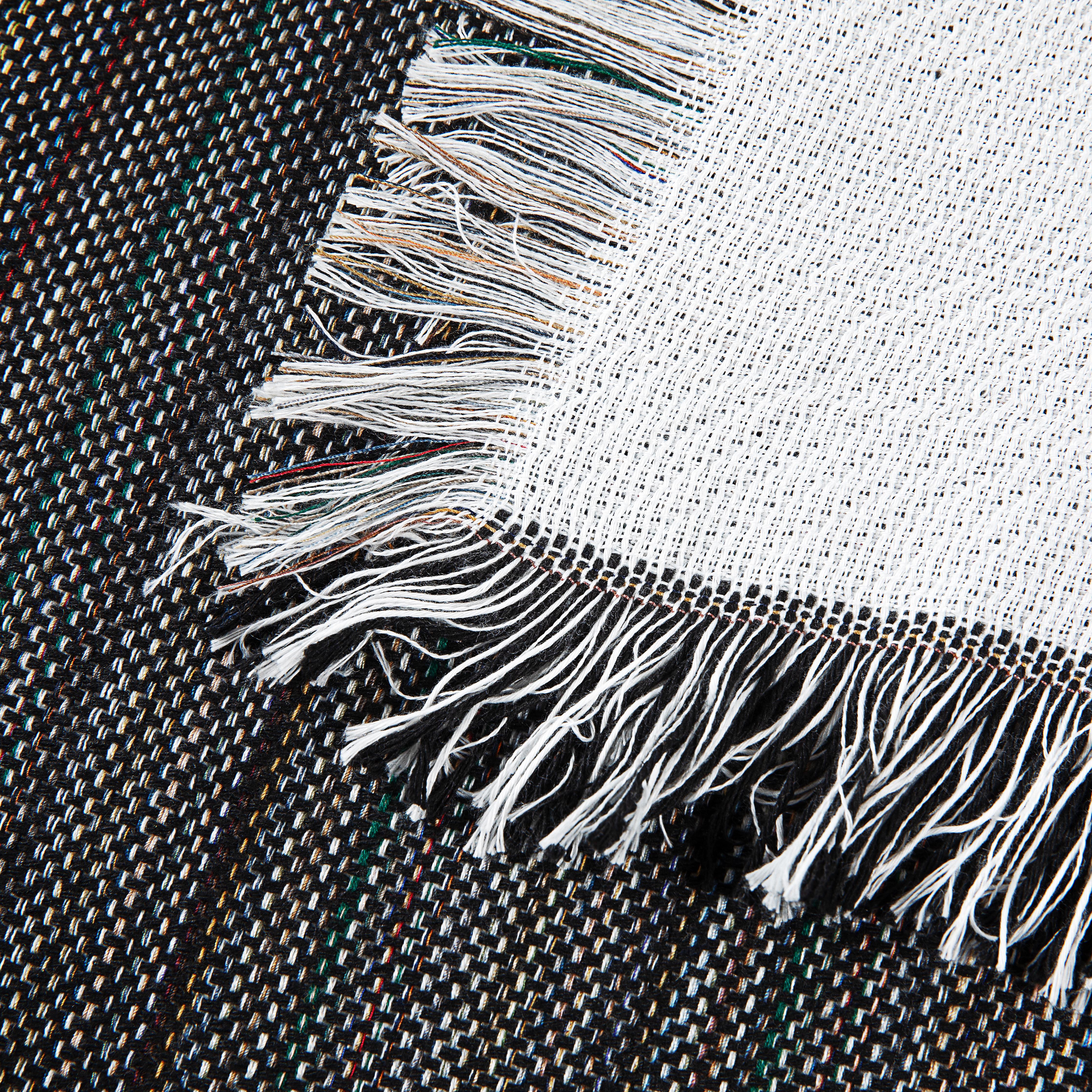
Preparing Your Artwork for Flawless Transfers
You line up a press, load a blank, and the transfer still comes out looking cheap. In my shop, that usually traces back to the file, not the heat press. A design that looked sharp on screen can print soft, sit too low, or disappear into the texture of a fleece throw once it hits the actual product.

Clean artwork saves production time and saves blanks. It also matters more once you sell beyond basic tees. A front print on a flat cotton shirt gives you some forgiveness. A transfer on sherpa, fleece, or other premium textured textiles does not.
Build the file for the transfer method
Start with the method you chose, then build the art around its limits.
Vector art is still the safest route for HTV. Cut lines stay clean, shapes hold their edges, and scaling is simple. If the design includes thin strokes, distressed effects, or tiny enclosed shapes, simplify it before you ever send it to the cutter. The weeding table is the worst place to discover that a design was too fussy to produce profitably.
Raster art works for transfer paper and DTF, but only if the file is prepared at final size with enough detail to print cleanly. Soft screenshots, web graphics, and upscaled customer logos are where many bad transfers begin. If you sell photo tees or full-color blanket panels, you must be strict.
Spark’s guide to heat transfer printer paper and file prep basics is a useful reference if you are still sorting out how print-ready artwork differs from a file that only looks good on a monitor.
Set the size for the product, not just the design
Sizing is where beginners waste good blanks. They judge the graphic by itself instead of by the printable field on the finished product.
For adult tees, front graphics often land well when they are proportioned to the chest area and placed a few inches below the collar. Practical shirt placement charts like the T-shirt design size and placement guide from Transfer Express are useful for checking common ranges before you print. Use those guides as a starting point, then adjust for the blank, the customer, and the style of the artwork.
That last part matters.
A bold athletic logo can carry more width than a delicate script design. A youth shirt usually needs a smaller visual footprint. A fleece throw or sherpa blanket needs much more margin around the design so the print does not feel cramped in the middle of a large, soft surface. On textured goods, small details can look even smaller once the fabric pile starts breaking up the edges.
Mirror settings cause expensive mistakes
Text backward on a finished piece is not a learning moment. It is a ruined order.
Use the transfer type, not habit, to decide whether to mirror:
- HTV usually needs mirroring because the material is cut from the back and flipped into place.
- Light-fabric transfer paper often needs mirroring because the print is commonly applied face down.
- Dark-fabric transfer paper may not use the same setup, so check the paper instructions every time.
- DTF usually is not handled like HTV for mirroring, so do not assume one workflow fits both.
Shops that add blankets and home textiles to the catalog need to be even more careful here because larger graphics make directional errors more obvious. A reversed phrase across a decorative throw is hard to miss.
Match the artwork to the fabric surface
Artwork that works on a smooth ring-spun tee can fail on fleece, sherpa, or heavier plush goods. The issue is not only print quality. It is readability and feel.
Use stronger shapes, cleaner type, and more open spacing on textured textiles. Keep thin outlines away from critical edges. Avoid putting tiny lettering into areas where pile or loft can break up the image. If the product is meant to feel premium, the artwork has to respect that surface. Customers notice when a transfer looks like it was dropped onto a blanket using the same layout you would use on a shirt.
A quick preflight check catches most preventable problems:
- Confirm final dimensions on the actual blank or a template with the same usable print area.
- Check image quality at final print size, not at zoomed-out screen view.
- Verify the mirror setting for that exact transfer method and paper or film.
- Remove fine details that will fight the cutter, the print, or the fabric texture.
- Print a paper mockup for placement if the product is oversized, textured, or unfamiliar.
That last habit saves more money than people expect. On shirts, it helps placement. On premium blankets and throws, it helps you see whether the design belongs on that product at all.
The Print, Cut, and Weeding Workflow
Once the artwork is ready, the job becomes physical. Here, speed tempts people into mistakes. Rushed trimming, careless cutter settings, and lazy weeding can undo an otherwise solid design.
Each method has its own bottleneck. HTV slows down at weeding. Transfer paper slows down at trimming. DTF slows down when film handling and order prep get sloppy.
HTV cutting and weeding
For HTV, send the mirrored file to your cutter and use settings that match the vinyl you’re loading. Don’t assume one preset works for every brand or finish. A small test cut saves time and material.
Weeding goes faster when the design is built with production in mind. Wide open shapes are easy. Tiny script fonts and distressed textures are not. If you’re spending too long picking tiny pieces out with a hook, the problem may be the artwork, not your tool.
A few practical habits help:
- Warm the vinyl slightly if your workspace is cold. It often weeds cleaner.
- Trim large sheets down first so you’re not wrestling unnecessary carrier area.
- Weed in sections on bigger jobs instead of trying to clear the whole sheet at once.
Transfer paper printing and trimming
Transfer paper looks straightforward until trimming starts. The print itself is usually the easy part. The cut edge decides whether the final shirt looks clean or homemade.
That’s why Spark’s overview of heat transfer printer paper is useful if you’re comparing paper styles and practical use cases.
For photo or contour-heavy designs, trim as close as the artwork allows. If you leave too much carrier around the image, the border shows. On some graphics that’s subtle. On others it ruins the look immediately.
A printable transfer can have strong color and still look cheap if the edge treatment is careless.
DTF film prep and handling
DTF removes some of the hand-trimming pain, but it adds process discipline. Keep film clean, keep the printed side protected, and stage jobs so you’re not mixing sizes or orientations on the press table.
For gang sheets and repeat orders, label everything before you walk to the press. Once multiple logos, names, and sizes are loose on the bench, confusion is easy.
Keep the bench organized
This sounds basic because it is basic. It still matters.
A reliable setup usually includes:
- One zone for printed or cut transfers
- One zone for weeded waste and trimming scraps
- One zone for garments or blanks waiting to press
- A final check area for orientation and placement
When the bench is messy, mirrored designs get applied backward, names get swapped, and trimmed edges get nicked. Production quality often looks like an equipment issue when it’s really a workflow issue.
Mastering Heat Application for Professional Results
A transfer usually fails at the press, not in the artwork file.
You can print a sharp design, cut it cleanly, and still end up with peeling corners, silvering, scorched fibers, or a patchy bond if the press setup is off. That problem gets worse as you move beyond standard tees into fleece throws and sherpa-backed blankets. Those blanks look forgiving on the table. Under heat, they expose every weak spot in your process.

Start with the surface you actually have
Press settings only work if the transfer can make full contact with the fabric. A flat cotton tee is straightforward. A plush blanket is not. Pile height, seams, hems, folded edges, and uneven loft all change pressure across the platen.
Pre-pressing helps remove moisture and relaxes the pressing area. Lint removal matters too, especially on fleece and sherpa where loose fibers can interfere with adhesion. If the blank has raised seams or bulky edges near the print zone, use a press pillow or pad to level the area. Forcing the press shut on an uneven surface usually gives you one part of the design that bonds well and another part that lifts after the first wash.
On premium blankets, test on the actual product, not a shirt scrap. Heat that looks fine on jersey can flatten pile, leave shine, or create a boxed press mark on softer textiles.
DTF responds well to consistency
For DTF on cotton, a dependable starting point is 300°F for 10 to 15 seconds at medium pressure, followed by a cool peel and a 5 to 10 second post-press, based on Transfer Superstars’ DTF pressing instructions.
Those numbers are a baseline, not a promise. Presses vary. So do blanks.
On fleece throws, heavier cotton blends, and textured products from suppliers like Spark Blank Textiles, I expect to spend time dialing pressure before I trust a full run. Too little pressure leaves weak edges. Too much pressure can crush texture or push adhesive unevenly into a high-pile surface. If you're comparing paper transfers with press-applied methods, Spark’s guide on how to print iron-on transfers is a useful reference.
A home iron has limits
A home iron can apply simple transfers for one-off personal projects. It does not give even pressure across the full image area, and that shows up fast on larger graphics.
That matters on shirts. It matters even more on blankets.
With iron-on paper, follow the transfer paper manufacturer’s time, temperature, and peel instructions exactly. Keep steam off. Hold steady pressure instead of sliding the iron around, which can shift the transfer and leave light-contact zones. For sellers, a heat press is the safer choice because it makes the result repeatable. Repeatability is what customers pay for.
Shop-floor note: If a method only works when the stars align, it is not ready for production.
Peel timing and post-press separate decent work from durable work
Every transfer type has its own peel window. Hot peel, warm peel, and cool peel are not interchangeable. Peeling too early can stretch adhesive before it sets. Peeling too late on the wrong material can affect finish or release.
DTF usually rewards patience. Let it cool as directed, peel at a controlled angle, then post-press. That second press improves the hand and helps lock the transfer down. New decorators often skip it because the print already looks finished. On wash-tested goods, that shortcut shows up later.
A simple check before each press keeps quality up:
- Pre-press the blank to remove moisture and flatten the print area
- Confirm placement and orientation before closing the platen
- Use a cover sheet if the transfer calls for one
- Peel at the correct temperature for that transfer type
- Post-press when required for finish and bond
A quick visual walkthrough helps lock the sequence in place:
Thick and textured blanks need their own press strategy
Standard shirt advice breaks down on plush and bulky textiles. Towels, fleece throws, and sherpa blankets shift more, compress more, and rebound differently after heat. A transfer can look straight before pressing and finish crooked because the surface settled unevenly under pressure.
Use stable reference points. Measure from finished edges that do not move much. Pre-press first, then check placement again, because some blanks change shape slightly once they warm up. On high-loft items, smaller designs often perform better than oversized ones because it is easier to get clean, even contact across the whole graphic.
The goal is not just to get the transfer on. The goal is to get a clean bond without damaging the feel of the textile. That trade-off matters more on premium products than it does on basic tees.
Tips for Sellers Batch Production and Quality Control
Making one clean sample proves the concept. Making fifty that all look the same proves the business.
The jump from hobby work to batch production is where a lot of shops feel strain. Manual alignment that feels acceptable on two shirts starts breaking down once the order table fills up. Small placement drift becomes obvious when items are stacked side by side.

Build repeatability into the setup
If your process depends on “that looks about right,” it won’t scale. You need fixed references. On shirts, that may mean platen marks, rulers, or alignment guides. On larger blanks, it often means custom templates or measured offsets from edges.
That matters even more on bulkier textiles. Thick fleece, woven surfaces, and plush blankets don’t always sit the same way twice. They can shift enough to make a clean transfer look crooked even if the press itself was correct.
Scaling to high-volume orders reveals the limits of manual alignment. For batch production, jig systems like custom wooden templates can cut setup time by 60% and reduce waste by 35% compared to relying on hand-pulling methods that fail at scale, according to the batch alignment reference video.
That’s why serious repeat work benefits from jigs. Not because jigs are fancy, but because they make your result less dependent on mood, fatigue, and luck.
Use a simple QC rhythm
Quality control doesn’t need to be complicated. It does need to be deliberate.
I’d break it into three checks:
| QC Stage | What to Check | Why It Matters |
|---|---|---|
| Before pressing | Blank defects, lint, correct transfer, correct size | Prevents avoidable waste |
| During the run | Placement consistency, pressure feel, peel behavior | Catches drift before it multiplies |
| After pressing | Edge adhesion, finish, visual straightness | Confirms the item is ready to sell |
This works better than inspecting everything only at the end. End-stage QC catches problems. Mid-run QC prevents them from repeating.
Troubleshooting what usually goes wrong
Most transfer failures are not mysterious. They’re usually one of a small number of issues.
- Peeling edges usually point to pressure problems, uneven contact, contaminated fabric, or a rushed peel.
- Cracking or poor finish often comes from overhandling, bad peel timing, or not following the transfer’s press window.
- Dull color can start with artwork prep, but it can also come from under-pressing or poor material pairing.
- Crooked graphics are often setup failures, not pressing failures.
A crooked transfer with perfect adhesion is still a reject.
When you find a problem, isolate one variable at a time. Don’t change temperature, time, pressure, and placement method all at once. That only makes diagnosis harder.
Brand details matter once the print is reliable
Once your front graphic is stable, add the pieces that make the item yours. Neck labels, sleeve marks, back-neck branding, care inserts, packaging cards, and coordinated product sets all help move the product beyond “blank with decoration.”
This is also where blank choice matters. If the base textile feels cheap, no amount of clean pressing fixes the perception. If the textile feels intentional, your transfer work has a stronger foundation.
Spark Blank Textiles is one option for shops adding non-apparel items like fleece throws, Sherpa blankets, beach towels, or picnic blankets into a customization lineup. That’s useful when you want your transfer process to extend beyond basic tees without switching to unrelated blank categories.
Keep records like a shop, not a hobbyist
Your memory is not a production system. Write things down.
Track these on repeat jobs:
- Blank type and color
- Transfer type
- Press settings used
- Placement reference
- Any adjustment notes from the run
Those notes become the difference between scrambling on a reorder and running it calmly.
From Blank to Brilliant Your Creative Journey Starts Here
A shop starts with a stack of blanks and a simple plan. Then the order mix changes. One customer wants left-chest tees, another wants a full-color fleece throw, and a third asks for a sherpa blanket that still feels soft after decoration. That is usually the point where a maker realizes transfer work is not one skill applied the same way every time.
Knowing how to make a transfer for at shirt gets you started. Knowing how to adjust for fabric weight, surface texture, pile, and finished use is what turns blank textiles into products people reorder.
The shops that grow past basic tees pay attention to the details that stay visible after pressing. Tight trimming matters on iron-on paper. Clean edges matter on DTF. Placement discipline matters even more on larger home goods, where a graphic that looks slightly off on a shirt can look obviously wrong on a blanket spread across a couch or bed.
Good results come from repeatable decisions. Use the transfer type that fits the fabric and order size. Build artwork for the actual item, not a generic template. Test on the actual blank before committing to a run. Keep the hand feel, wash performance, and visual balance in mind, especially on premium textiles where the base product already carries more perceived value.
That matters when you expand into textured and giftable items. Fleece throws, sherpa blankets, towels, and similar blanks can be excellent add-ons for small businesses, but they expose sloppy process fast. Heat that works on a standard cotton tee can flatten pile, shift texture, or leave the print sitting awkwardly on a plush surface. The same fundamentals still apply. The tolerance for shortcuts gets smaller.
If you are building a product line beyond standard apparel, Spark Blank Textiles offers curated blank textiles for decoration, including blankets, towels, and other print-ready items for makers, print shops, and growing small businesses.