Achieve Perfect Results with Printer Heat Transfer Paper
You print the artwork, line it up on a beautiful blanket, press it, peel it, and the result looks decent for about five minutes. Then the edges start lifting. Or the graphic sinks into the pile and looks washed out before it ever reaches your customer. That’s the moment when a lot of small shops decide printer heat transfer paper “just doesn’t work” on premium textiles.
The problem usually isn’t the paper alone. It’s using T-shirt advice on products that don’t behave like T-shirts.
Blankets, towels, sherpa, fleece, and woven pieces ask for more control. They hold moisture differently, compress differently, and punish uneven pressure fast. If you sell custom gifts, boutique merch, team blankets, or promotional textiles, you need a tighter process than “press it and hope.” You need to know which paper fits the job, how to prep the print, and how to adjust for texture and weight before you ruin a good blank.
That matters more every year because the heat transfer paper market is already significant and still growing. The global market was valued at USD 541.1 million in 2024 and is projected to reach USD 713.1 million by 2034, driven by demand for personalized apparel and home textiles, according to Future Market Insights on the heat transfer paper market.
From Blank to Brilliant with Printer Heat Transfer Paper
A failed shirt transfer is annoying. A failed blanket transfer is expensive.
When you’re working on a plush throw or a heavier woven piece, every mistake costs more because the blank itself has value. You’re not testing on a basic tee from a bargain bin. You’re trying to turn a premium textile into a finished product someone will gift, display, or keep for years. That changes how careful you need to be with printer heat transfer paper.
The common pattern looks like this. A shop owner uses the same transfer routine they trust for cotton apparel, then moves to a sherpa throw or fleece blanket. The press closes, the design seems bonded, and the first peel looks promising. After washing, the transfer cracks over high-pile areas, or the edges begin to separate where the pressure never reached evenly.
That’s where experienced shops start making different choices.
What premium textiles change
High-GSM and textured goods create three practical problems:
- Uneven contact: Plush and pile keep some parts of the design farther from the heat platen.
- Moisture retention: Blankets and thicker textiles often hold enough moisture to interfere with bonding.
- Heat penetration: A setting that works on a thin shirt may not drive the transfer evenly into a heavier item.
Practical rule: If a transfer method only works when conditions are perfect, it isn’t production-ready for blankets.
For small print shops and Etsy sellers, that distinction matters. A method can look acceptable in a sample photo and still fail in real production when you’re handling custom names, one-off art files, and quick reorder timelines.
What actually works
The shops that get repeatable results usually do a few unglamorous things well. They test on the actual textile, trim aggressively, pre-press textured surfaces, and respect peel timing instead of rushing it. They also choose printer heat transfer paper based on the blank, not based on whatever paper they already have on the shelf.
That’s the difference between a transfer that sits on top of a blanket like a sticker and one that looks intentional, clean, and sellable.
Your First Decision Inkjet vs Laser Transfer Paper
The first fork in the road is simple. Inkjet and laser transfer papers are not interchangeable, and the better choice depends on the finish you want, the color of the fabric, and how often you plan to produce.

If you’re still sorting out equipment, Spark has a useful guide on printers for heat transfer paper that helps match printer type to transfer workflow.
Inkjet paper for softer hand and lighter blanks
Inkjet transfer paper is usually the better fit when you care most about feel. On light fabrics, it tends to leave a softer result than laser alternatives, which is why many makers prefer it for blankets that people will touch and use.
For light-fabric inkjet transfers, the method needs to be exact. Print mirrored, press at 375°F for 30 seconds with heavy pressure, and use a cool peel. That process delivers over 95% success for wash durability across 50+ cycles and gives a softer hand-feel than laser, according to JET PRO SS application guidance from Ace Screen Supply.
That makes inkjet a strong option for white or very light fleece throws, lighter-colored polyester blends, and gift items where comfort matters as much as color.
Laser paper for dark fabrics and cleaner opacity
Laser transfer paper earns its place when the substrate is darker or when you need stronger opacity. Toner-based transfers generally handle bold logos and sharp text well, especially on fabrics where transparent-style papers would lose definition.
Laser paper also fits shops that value workflow speed and consistency from toner printing. The trade-off is feel. On premium textiles, especially pieces intended for cuddling or decorative home use, some laser transfers can feel more noticeable on the surface than a well-executed light-fabric inkjet transfer.
Light fabric paper and dark fabric paper are different tools
Many failed projects originate from this point. People talk about “transfer paper” as if it’s one thing. It isn’t.
For light fabrics
Light-fabric paper is designed to let the textile color show through around the print area. That’s why it works best on white or pale blanks. If you put it on a dark textile, the artwork usually loses brightness and the unprinted areas won’t disappear the way you hoped.
Use it when the base textile supports the design instead of fighting it.
For dark fabrics
Dark-fabric paper uses an opaque layer to block the garment color underneath. That gives you stronger color on black, charcoal, navy, and other deep shades, but it also means trimming and edge control matter more. On a blanket, sloppy trimming is visible fast because the piece is large and the viewer isn’t expecting a boxed-in graphic.
A transfer that looks acceptable on a chest logo often looks clumsy on a blanket panel. Scale makes every edge more obvious.
How I’d choose by product type
For a pale fleece throw with a full-color photo or soft watercolor artwork, I’d lean inkjet light paper first because the finish suits the product better.
For a darker textile with a bold graphic, event branding, or a name layout that needs strong opacity, laser dark-fabric paper makes more sense. It holds its own visually where transparent-style solutions won’t.
For woven blankets, caution matters. Texture changes everything. Fine detail can break up visually across the weave, so simpler shapes and stronger contrast usually outperform delicate gradients.
The real trade-offs
Here’s the decision in working-shop language:
| Paper type | Usually works best when | Watch out for |
|---|---|---|
| Inkjet transfer paper | You want softer feel on light fabrics and smaller-batch customization | Moisture, smudging, and poor results if mirroring or peel timing is wrong |
| Laser transfer paper | You need opacity on dark fabrics or cleaner production workflow with toner | Heavier surface feel, visible edges if trimming is sloppy, and less forgiveness on textured goods |
Do this, not that
- Choose by blank first: Start with the textile color, texture, and end use. Don’t start with the printer you happen to own.
- Match finish to customer expectations: A cozy blanket should still feel cozy. If the transfer feels like a patch, the product experience suffers.
- Reserve dark-fabric papers for jobs that need opacity: They solve one problem and introduce another. Use them intentionally.
- Test on the exact substrate: A setting that behaves on a flat sample swatch can fail on a sherpa face or plush throw.
The best results usually come from accepting that printer heat transfer paper is a system, not just a sheet. Printer, paper, fabric color, texture, and intended feel all have to line up.
Perfecting Your Print Before the Press
Most transfer failures show up under the heat press, but plenty of them start at the computer.
If the file is wrong, if the printer setting is wrong, or if the room is working against the paper, the press can’t rescue the job. Good transfer work starts before the sheet ever touches fabric.

A basic refresher on how transfer paper works helps if you want the mechanics behind why certain files and settings matter more than others.
Start with the file, not the printer
Large home-textile graphics expose weak artwork quickly. A design that looks fine on a laptop screen can print soft, jagged, or muddy once it’s scaled for a blanket panel.
Three checks prevent most of that trouble:
- Mirror when required. Light-fabric transfers often need the artwork printed in reverse. Forgetting this is one of the fastest ways to waste a sheet.
- Use artwork built for print. Small web graphics don’t hold up on larger-format textile work.
- Keep edges intentional. Transparent backgrounds, contour cuts, and clean outlines matter more on blankets because dead space is easy to spot.
If you’re helping customers supply artwork, a short reference on the best file format for printing is useful because it explains why some file types stay crisp and others fall apart when resized.
Printer settings that actually affect the transfer
A lot of users hit print with default settings and assume the paper will compensate. It won’t.
Use the correct media setting for the paper you’re running. Depending on the printer, that may mean choosing a heavier stock or photo-style media option so the printer lays down ink or toner more appropriately. If the printer underfeeds ink, color looks weak. If it overfeeds, drying problems start.
A few habits help:
- Print a small proof first: Check color balance and edge quality before committing a full sheet.
- Feed one sheet at a time when paper is temperamental: Transfer papers can be less forgiving than office paper.
- Store paper sealed and flat: Curled edges and moisture pickup create feeding trouble fast.
Bad output is often blamed on the press, but the damage was already baked in at print time.
The room matters more than people think
Environmental conditions are one of the most overlooked causes of inconsistent transfer results. Low humidity can create static and toner misfeeds in laser printers. High humidity can cause ink smudging on inkjet papers. Maintaining 40 to 60% humidity is a key but often ignored step for consistent results and may reduce waste, according to JPPlus on environmental conditions and heat transfer printing.
That shows up in real shops in very ordinary ways. Paper feeds crooked. Toner lands inconsistently. Ink takes too long to settle. Then the operator starts adjusting press temperature for what is really an air problem.
A simple pre-press-room checklist
| Check | Why it matters |
|---|---|
| Paper stored dry and flat | Prevents curl and erratic feeding |
| Correct image orientation | Avoids reversed text and wasted sheets |
| Printer media setting matched to paper | Improves coverage and print quality |
| Room humidity controlled | Reduces static, smudging, and misfeeds |
The cleanest transfer jobs usually look calm long before pressing starts. Good file in. Good sheet out. Stable room. Then the press has a real chance to do its job.
Mastering the Heat Press on Premium Textiles
Heat pressing blankets and textured goods is where generic advice falls apart. A flat cotton shirt forgives a lot. Sherpa, fleece, and woven products don’t.
The moment you move into heavier textiles, pressure distribution becomes just as important as temperature. Plush surfaces compress unevenly, and thick constructions resist fast heat penetration. If you skip prep, the transfer may bond to the high spots first and fail everywhere else.

Pre-pressing is not optional on textured blanks
Standard heat transfer advice often fails on textiles over 300 GSM like sherpa or woven blankets. These fabrics need a 10-second pre-press to flatten the pile, plus added dwell time of +5 seconds for every 100 GSM over 300 so heat can penetrate properly and the transfer doesn’t crack or peel after washing, according to BDF Graphics on types of heat transfer paper.
That single adjustment fixes a lot of “mystery” failures.
A pre-press does three jobs at once. It removes surface moisture, smooths the print area, and lets you see how the fabric reacts under pressure before the actual transfer goes down. On sherpa and micro-plush, it also helps tame the surface enough to make placement more predictable.
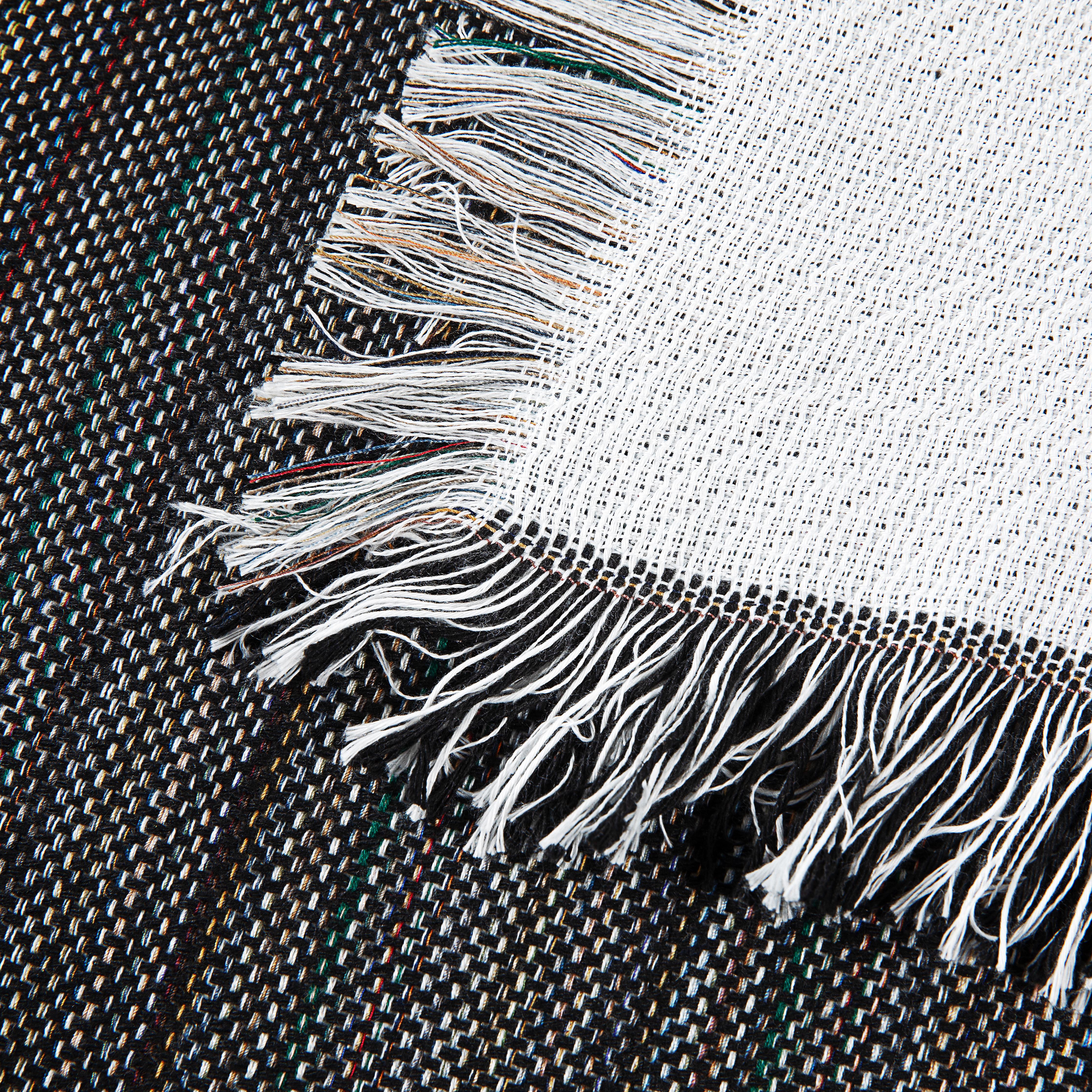
Cutting and positioning matter more on blankets
A blanket gives the eye a lot of room. Crooked placement or bulky excess film looks amateurish fast.
Cut close to the artwork when the transfer type allows it. On dark-fabric papers, dead area around the design is often the first thing a customer notices. If the design is large, use alignment marks, a folding method, or light reference points so the sheet doesn’t drift when you close the press.
For small add-ons like personalization, I also like to think about where the product folds and drapes. A monogram near a folded edge can disappear in use. A centered design on a plush face may need visual compensation because the texture softens sharp geometry.
Heat presses don’t fix poor layout. They only lock it in permanently.
A lot of shops also branch into finishing details like size tags and care IDs for resale items. If that’s part of your workflow, DIY printable clothes labels is a practical reference for label ideas that pair well with custom textile production.
Spark Blank Textiles Heat Press Settings Guide
These settings are a starting framework for premium textiles. Always confirm with the paper manufacturer’s instructions, then test on the actual blank before running production.
| Spark Textile Product | Temperature | Time | Pressure | Peel Method |
|---|---|---|---|---|
| Fleece Sublimation Throw 300 GSM | Start with the paper manufacturer’s recommended temperature | Use the paper’s standard dwell time, then adjust upward only if needed | Medium to heavy, depending on surface smoothness | Follow paper instructions |
| Sherpa Sublimation Throw 430 GSM | Start with the paper manufacturer’s recommended temperature | Standard dwell time plus added time for thickness | Medium, with careful even contact | Follow paper instructions |
| Outdoor Picnic Blanket 410 GSM micro-plush top | Start with the paper manufacturer’s recommended temperature | Standard dwell time plus added time for thickness | Medium and even | Follow paper instructions |
| Woven Tapestry Blanket | Start with the paper manufacturer’s recommended temperature | Test longer dwell carefully because weave and thickness change transfer behavior | Medium, avoid crushing texture | Follow paper instructions |
Pressure is where many shops go wrong
Heavy pressure sounds safe until it leaves a press box outline, flattens the textile too aggressively, or creates an obvious impression around the artwork. On fleece and plush goods, more pressure isn’t always better. Even pressure is better.
If the transfer only bonds in the center, check whether the textile is bunching or whether seams, hems, or folded bulk are tilting the platen contact. A pressing pillow or setup adjustment can help compensate, but the bigger lesson is simple. The press has to close evenly across the print area.
A repeatable pressing routine
This is the routine I’d trust on premium home textiles:
- Lint-roll and inspect the surface. Fibers, dust, and stray threads become visible under transferred graphics.
- Pre-press the blank. Use the flattening step, especially on sherpa, fleece, and plush surfaces.
- Position the transfer carefully. Secure it if movement is likely.
- Press using the paper’s base instructions. Then account for fabric thickness rather than improvising wildly.
- Peel exactly as directed. A rushed peel can ruin an otherwise correct press.
- Repress only if the transfer system allows it. Some papers benefit from a finishing press. Others do not.
Here’s a demonstration worth watching before your next run:
For more product-specific setup guidance, Spark’s heat press for transfer paper article is a practical companion.
What works and what doesn’t
- Works: Testing on the exact blanket or towel you plan to sell.
- Works: Pre-pressing high-pile areas before alignment.
- Works: Adding dwell time thoughtfully as thickness increases.
- Doesn’t work: Copying a thin-shirt recipe onto a 410 or 430 GSM textile and expecting the same bond.
- Doesn’t work: Letting urgency push you into peeling early.
- Doesn’t work: Assuming visible adhesion at press time guarantees wash durability.
Pressing premium textiles well is less about magic settings and more about discipline. The operators who get clean, durable transfers aren’t guessing less because they’re lucky. They’re guessing less because their method is tighter.
Achieving a Durable Finish and Post-Press Care
The press opens, and the job still isn’t finished.
A lot of transfers fail in the minute after pressing because the peel is rushed, the sheet is lifted at the wrong temperature, or the finished piece is handled as if the bond is already fully stable. This stage decides surface feel, edge quality, and how the design behaves after the first wash.

The transfer process itself involves printing, cutting, positioning, and pressing for 10 to 30 seconds at the specified temperature. Pre-washing fabrics is also recommended to remove sizing, which can improve adhesion and wash-fastness on premium textiles, according to Ninja Transfers on how to use heat transfer paper.
Hot peel and cold peel are not interchangeable
Some transfer papers want the carrier removed almost immediately. Others need the sheet to cool before peeling. Mixing those up can ruin a perfectly pressed print.
A hot peel usually suits transfer systems designed to release quickly while the adhesive or toner layer is still in the right state. A cold peel asks for patience. On papers that require cooling, waiting gives the transfer time to settle so the image releases cleanly instead of stretching or lifting.
If the manufacturer says cold peel, treat that as process-critical, not optional.
Peel timing is part of the press recipe. It isn’t an afterthought.
What to do right after pressing
A clean finish usually comes from a short checklist:
- Let the transfer reach the right peel stage. Don’t test a corner too early unless the paper allows it.
- Peel smoothly, not aggressively. Fast jerking motions can stress delicate edges.
- Inspect the perimeter first. Most failures start at the outer edge, not the center.
- Allow the item to rest before packaging. Heat-softened surfaces can pick up marks if folded immediately.
Care instructions worth passing to customers
If you sell finished blankets or towels, your customer care card matters almost as much as your press settings.
- Wait before the first wash: Give the transfer time to settle fully before laundering.
- Wash gently: Turn the item so the design is protected as much as possible during cleaning.
- Skip harsh treatment: Strong chemicals, aggressive heat, and rough handling shorten the life of any transfer.
- Dry with care: Lower heat is safer than blasting the item in a hot dryer.
The point isn’t to make the product precious. It’s to help the print age well. Good post-press handling and clear care instructions reduce complaints, protect your reputation, and make reorders easier because the customer remembers the product holding up.
Solving Common Printer Heat Transfer Paper Problems
When a job goes wrong, the symptom usually tells you where to look. The trick is reading it correctly.
The transfer cracks after washing
The usual cause is incomplete bonding. On blankets and textured textiles, that often means the transfer never made full contact across the surface.
Check three things first:
- Pre-pressing: If you skipped flattening the pile, start there.
- Dwell time: Thick goods often need more time than flat apparel.
- Peel timing: Pulling the carrier at the wrong stage can weaken the bond before the item ever gets washed.
There’s a faint box around the design
That’s often excess transfer material or too much visible carrier area.
Trim tighter, especially on dark-fabric papers. If the box looks like an impression in the textile rather than excess film, pressure may be too aggressive or the pressing area may be showing a platen edge effect on plush fabric.
The colors look dull
Dull output usually starts before the press. Weak print settings, damp paper, or poor file quality all show up as lifeless color.
Then look at the substrate. High-pile and textured surfaces naturally reduce crispness because the image doesn’t sit on a perfectly flat face. Simplifying the artwork often helps more than increasing heat.
If a design depends on subtle detail to look good, it may be the wrong design for plush texture.
The transfer peels at the edges
Edge lifting usually points to one of four issues: moisture, uneven pressure, poor trimming, or a mismatch between paper type and fabric.
On textured blankets, edges are the first place to fail because they sit over changing surface height. Pre-press the textile, check for level contact, and make sure you’re not using a paper meant for a flatter or lighter substrate than the one in front of you.
The paper won’t feed cleanly through the printer
Look at the environment and storage conditions. Curled sheets, static, or moisture pickup can all create random feeding trouble.
Feed single sheets when needed, keep paper sealed, and bring the room conditions under control before you blame the printer. A lot of “bad paper” turns out to be paper that sat in the wrong environment too long.
Turning Your Blanks into Brilliant Best-Sellers
Good printer heat transfer paper results don’t come from one magic setting. They come from matching the paper to the printer, the artwork to the fabric, and the press method to the actual textile in front of you.
That’s especially true once you leave basic apparel and start producing blankets, towels, and woven goods. Thick, textured blanks need more prep, more attention to pressure, and a lot more respect for peel timing. Shops that understand that usually waste less material and deliver products that look more intentional from the first order.
The biggest shift is learning to stop treating premium textiles like oversized T-shirts. A sherpa throw doesn’t press like a tee. A woven tapestry doesn’t display detail the same way a smooth knit does. Once you accept that, your process improves fast.
The upside is real. When you dial in printer heat transfer paper for premium blanks, you can offer custom home-textile products that stand out from generic apparel work. That gives small shops, Etsy sellers, and gift businesses room to sell pieces that feel more substantial and more memorable.
From blank to brilliant is a process. Better paper choice, cleaner file prep, smarter pressing, and stronger aftercare all stack together.
If you’re ready to put these techniques to work, browse the curated blank textiles at Spark Blank Textiles for products built for customization, including fleece throws, sherpa blankets, woven pieces, towels, and other premium surfaces that suit print, embroidery, and personalized gift production.